Marfeel
Senior Product DesignerFront-end DeveloperMarfeel is a publishing and analytics SaaS platform used by hundreds of publishers to increase audience engagement, optimize content performance, and grow revenue across mobile and web experiences.
Context & Challenge
Marfeel acquired Newsroom — a performance tracking tool — and needed to bring its features into a unified, scalable product experience. The core challenge was reorganizing and translating a broad set of capabilities into a coherent information architecture, user flows, and interface patterns that felt intuitive for editors and publishers alike.
Marfeel Compass and Newsroom
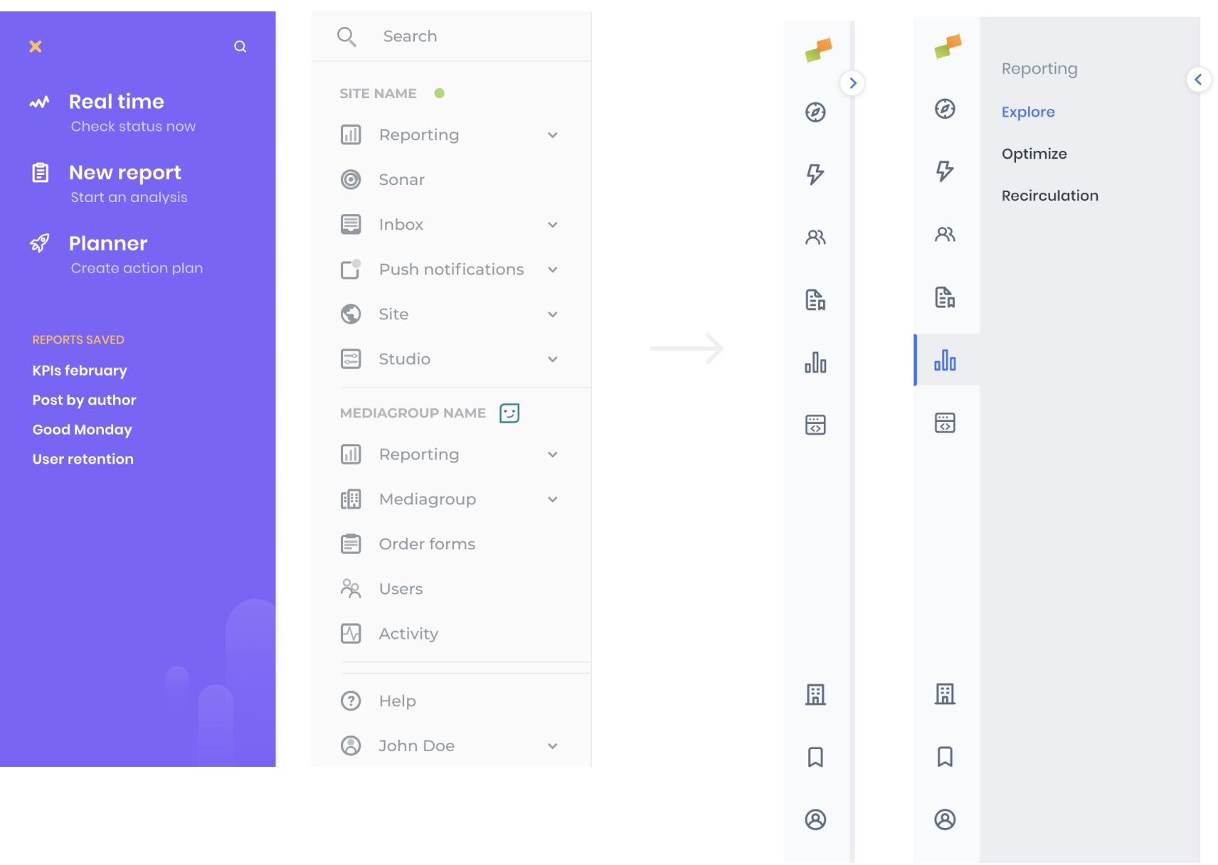
Navigation Redesign
We reorganized the product architecture and redesigned the sidebar to reduce cognitive load and improve discoverability, paving the way for future scalability.
- Grouped related features into logical areas.
- Collapsible sidebar to maximize canvas space when needed.
- Revamped iconography for clearer visual differentiation.
This reduced cognitive load and made navigation more scalable and predictable.
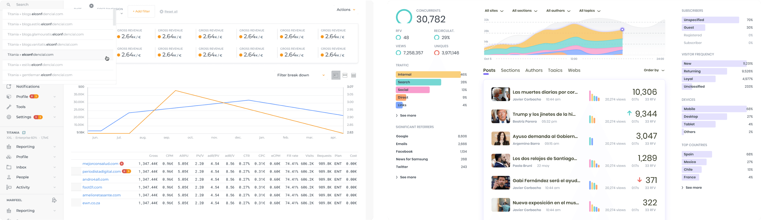
Main dashboard & KPI Visualization
We shaped the main dashboard to display the most critical business metrics in a concise, readable layout — using consistent color tokens to help users quickly identify key performance sources (e.g., traffic by medium across posts, sections, authors).
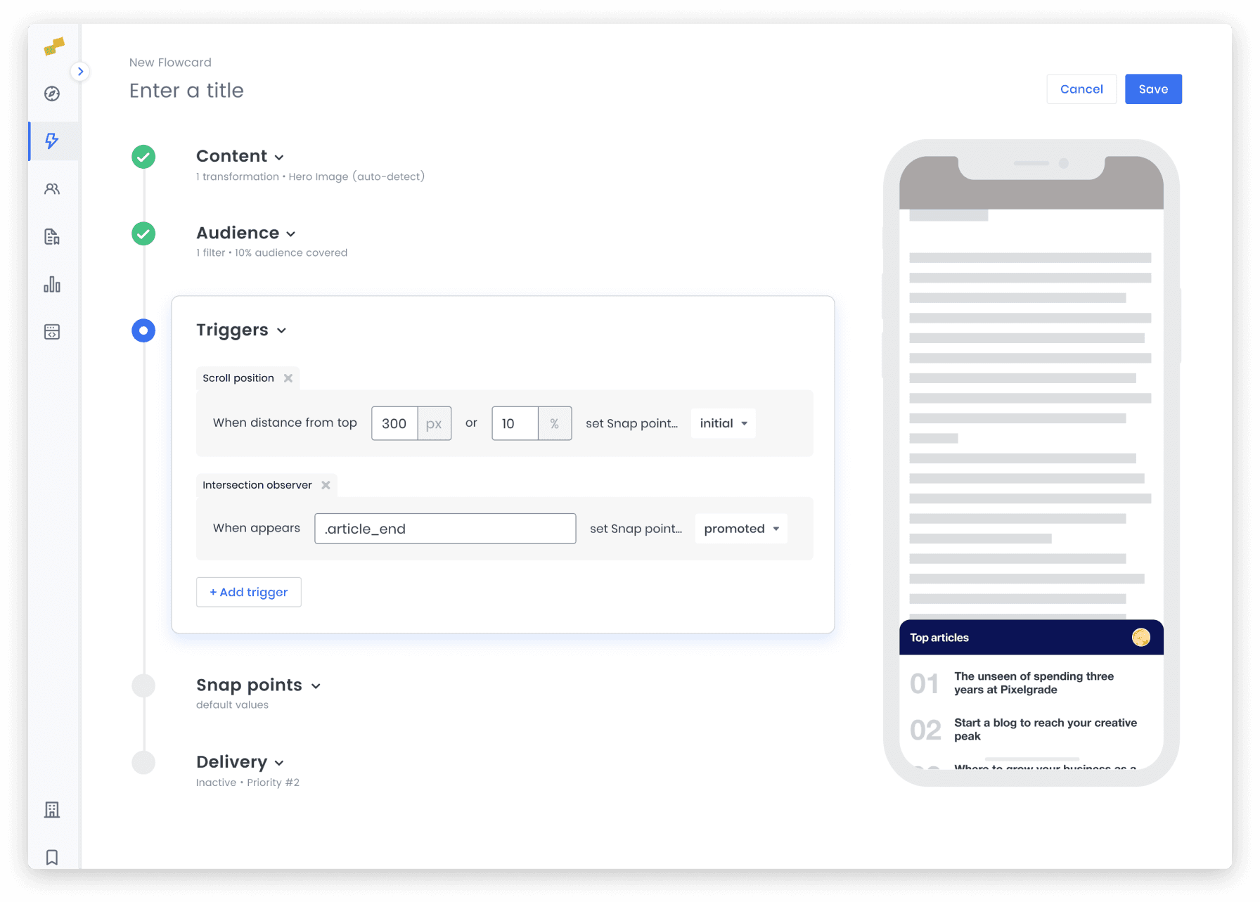
Flowcards Simplified
Flowcards promote content by using micro-segmentation capabilities and a no-code approach. Any editor can trigger a Flowcard to deliver specific content.
- Grouped configuration fields into collapsible steps.
- Created a clear sense of progress throughout the flow.
- Reduced visual complexity to minimize frustration.
This improved usability and made the creation process feel less intimidating.
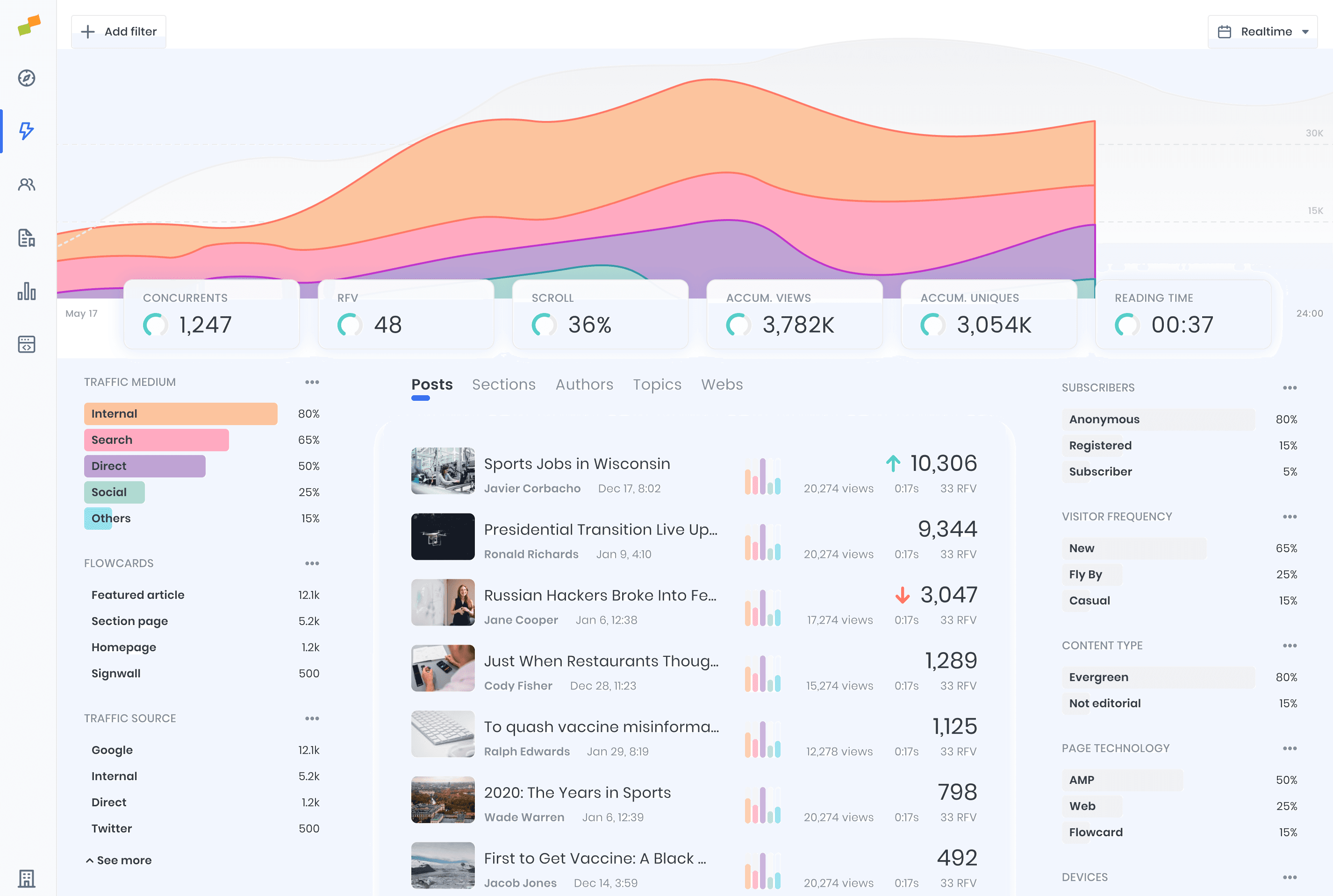
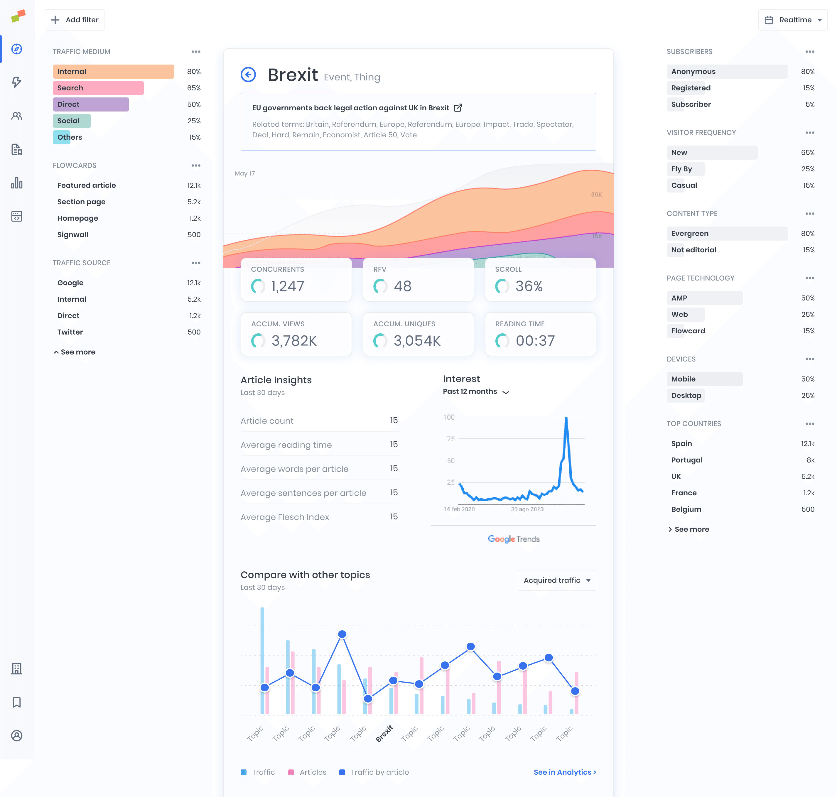
Detail page - Topic View
By applying a consistent visual hierarchy and design patterns throughout the product, we ensured that essential data across topics and dashboards was easier to scan and understand.
Design System Leadership
I defined and implemented a fully documented Design System that served both designers and developers, encompassing:
- Design tokens and layout foundations.
- Component libraries and documentation.
- Assets, typography, and interaction guidelines.
We adopted a new design direction with:
- A more legible typeface for data visualization.
- Cohesive patterns for familiarity.
- Increased white space to reduce visual noise.
- Rounded shapes and pastel tones to lower cognitive load
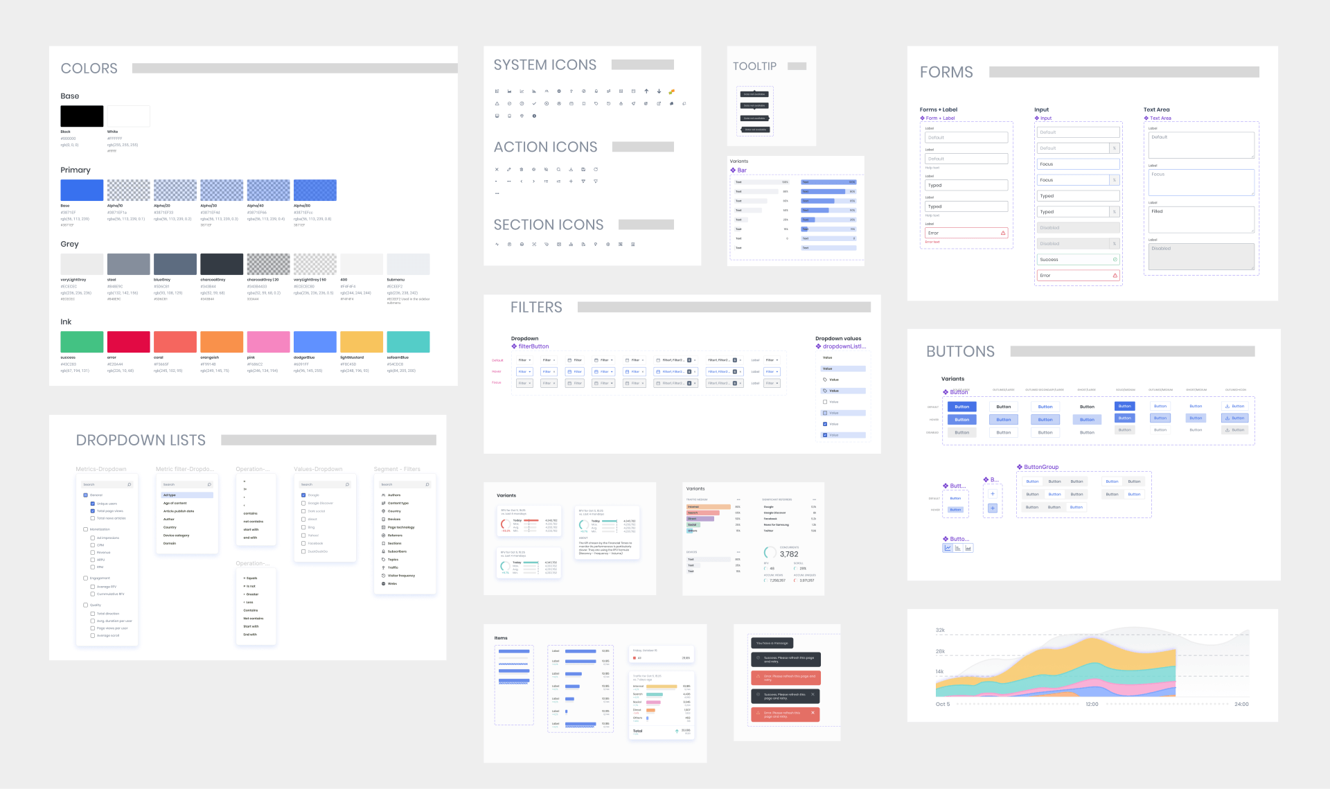
Foundation and Component samples from the Design System
Developer Handoff & Implementation
To keep design and engineering tightly aligned:
- I matched Figma variants to development props for straightforward component mapping.
- Documented the design system in Storybook, providing developers with a centralized source of truth for components and usage guidelines.
This eliminated ambiguity in implementation and helped maintain fidelity across iterations.
Final Thoughts
Through this work, we transformed a fragmented set of features into a unified product experience with a scalable architecture, improved usability, and a shared design language — empowering both publishers and internal teams to work more effectively.